Thursday, May 31, 2012
Wednesday, May 30, 2012
30 May 2012 - 90s Gestures
Source: http://www.quickposes.com/pages/gesture
What I learned:
I found my rhythm toward the end: head > torso > rest of body. The torso is what decides the gesture. At first I was drawing the contour head, neck, chest, arms etc... and that knocked the proportions and flow out of the gesture
Painting Tut- To apply
For mood, lighting and using brushes.
Also overlapping forms to create depth/3D effect
http://fengzhudesign.com/episode_22_part1_video.html#anchor
Also overlapping forms to create depth/3D effect
http://fengzhudesign.com/episode_22_part1_video.html#anchor
Mock book cover video
The process video, I feel like I missed the mark completely (during the first steps). Silhouette first, then details come way after.
To learn:
- Interesting shapes
- Avoid that head/neck alignment
- Concentrate on hands
- show folds and materials with values
- Push values more and more
- Details have to mean something, not just squiggly lines
Stuff that I liked:
- Fur
- Hat and curls
- Eyes when they were first drawn
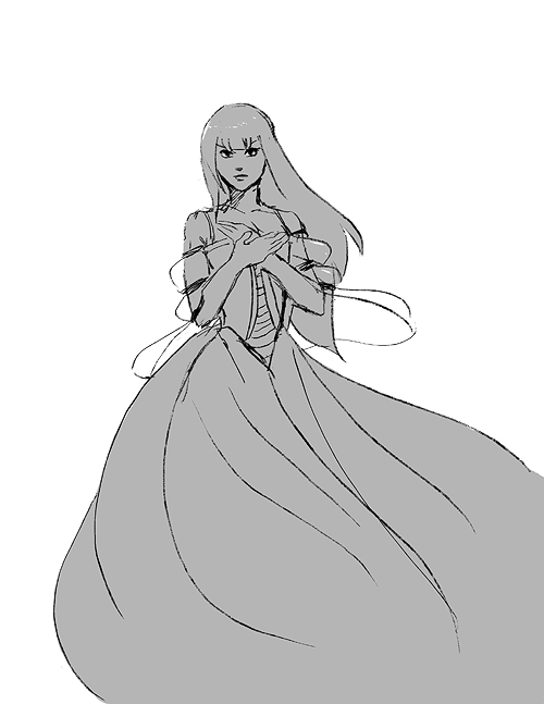
Dress- 12 mins

To Learn:
- More details on clothes
- Interesting hand gestures
- Flowing natural hair
- Face contour
Stuff that I liked:
- clean lines
- Clean contrasts
- Flowing skirt
- Eye are (somewhat) balanced
- Pose not too stiff
Tuesday, May 29, 2012
Derpy book cover
Just a test to use for a mock cover. I didn't want to invest a lot in this drawing, but it ended spending a lot of time editing. All in all, it wasn't a success, instead of working on the silhouette and taking it from there, I wasted time drawing familiar & faulty shapes.
Plus the shadows could be pushed a lot more.
Links - Artists blogs + Tuts
Light, comp and color study/Tut: http://www.conceptart.org/forums/showthread.php?t=56806
Tutorials: http://enliighten.com/
http://chrisrahnart.blogspot.ca/
http://daarken.com/blog/
http://leo-and-diane-dillon.blogspot.ca/
Monday, May 28, 2012
Red
I was testing the screen recorder thingy, lost the AVI file. No biggie, it was a quick sketch anyway.
Sunday, May 27, 2012
Character Design 2
More character designs, still in the fantasy genre. I read a lot of High Fantasy books (and some manga too). I like the belt thnigy.
Not all sword ladies are pretty, some have to be angular and masculine to be convincing. Either way I don't like the brush I used for this sketch. I passed over the line too many times.
Yay! A guy design, cool cool. I don't only draw girls. I mostly draw girls because of the dresses and hair :)
Not all sword ladies are pretty, some have to be angular and masculine to be convincing. Either way I don't like the brush I used for this sketch. I passed over the line too many times.
Yay! A guy design, cool cool. I don't only draw girls. I mostly draw girls because of the dresses and hair :)
Character Design 1
Design- Fantasy characters.
There is a story but it's far too undercooked, so I stared with a little bit of generic design to get the cliche out of my system. Though I've been told that research is the prefect cliche antidote.
ps: long hair is awesome
Hello blog :)
Here we go, very first post.
I drew the girl while listening to Lies of Locke Lamora audiobook. The skeleton thingy was a stab at a King of Hell Character, looks more like a janitor of hell.
Subscribe to:
Comments (Atom)


